1. Mastering Data Visualization with Matplotlib
1.1. Introduction
This comprehensive lecture series focuses on mastering Matplotlib, one of the most popular libraries in Python for data visualization. We will explore various functionalities of Matplotlib, understanding how to create a wide array of plots to effectively communicate data insights.
1.2. Part 1: Understanding Matplotlib Basics
1.2.1. Overview
Matplotlib is a comprehensive library for creating static, animated, and interactive visualizations in Python. It provides a low-level interface for creating a variety of plots, giving you full control over every aspect of the figure.
1.2.3. Importing Matplotlib
Import Matplotlib in your Python script:
import matplotlib.pyplot as plt
1.2.4. Creating Basic Plots
Line Plot:
# Sample Data
x = [1, 2, 3, 4, 5]
y = [10, 20, 25, 30, 35]

# Plot
plt.plot(x, y)
plt.title('Line Plot Example')
plt.xlabel('X-axis')
plt.ylabel('Y-axis')
plt.show()
Bar Plot:
# Sample Data
categories = ['A', 'B', 'C', 'D']
values = [4, 7, 1, 8]

# Plot
plt.bar(categories, values)
plt.title('Bar Plot Example')
plt.xlabel('Categories')
plt.ylabel('Values')
plt.show()
Scatter Plot:
# Sample Data
x = [5, 7, 8, 7, 2, 17, 2, 9, 4, 11, 12, 9, 6]
y = [99, 86, 87, 88, 100, 86, 103, 87, 94, 78, 77, 85, 86]

# Plot
plt.scatter(x, y)
plt.title('Scatter Plot Example')
plt.xlabel('X-axis')
plt.ylabel('Y-axis')
plt.show()
1.3. Part 2: Advanced Plotting Techniques
1.3.1. Histograms
Histogram:
# Sample Data
data = [1, 2, 2, 3, 3, 3, 4, 4, 4, 4]

# Plot
plt.hist(data, bins=4)
plt.title('Histogram Example')
plt.xlabel('Data Bins')
plt.ylabel('Frequency')
plt.show()
1.3.2. Box Plots
Box Plot:
# Sample Data
data = [1, 2, 3, 4, 5, 6, 7, 8, 9, 10]

# Plot
plt.boxplot(data)
plt.title('Box Plot Example')
plt.ylabel('Values')
plt.show()
1.3.3. Pie Charts
Pie Chart:
# Sample Data
labels = 'A', 'B', 'C', 'D'
sizes = [15, 30, 45, 10]
colors = ['gold', 'yellowgreen', 'lightcoral', 'lightskyblue']

# Plot
plt.pie(sizes, labels=labels, colors=colors, autopct='%1.1f%%', startangle=140)
plt.title('Pie Chart Example')
plt.show()
1.4. Part 3: Customizing Plots
1.4.2. Changing Line Styles and Colors
Change line style and color:
plt.plot(x, y, linestyle='--', color='r')
plt.show()
1.4.3. Adding Annotations
Add annotations to your plot:
plt.plot(x, y)
plt.annotate('Highest Point', xy=(4, 30), xytext=(3, 35),
             arrowprops=dict(facecolor='black', shrink=0.05))
plt.show()
1.5. Part 4: Real-world Applications and Case Studies
1.5.1. Healthcare Data Analysis
Visualize patient wait times using histograms.
Analyze service distribution with bar plots.
1.5.2. Financial Data Analysis
Visualize stock market trends with line charts.
Analyze portfolio performance using scatter plots.
1.6. Part 5: Best Practices for Data Visualization
1.6.1. Clarity
Ensure your visualization is easy to understand.
1.6.2. Accuracy
Represent data accurately without misleading.
1.6.3. Aesthetics
Use color and design effectively but avoid over-complicating.
1.6.4. Context
Provide context with titles, labels, and legends.
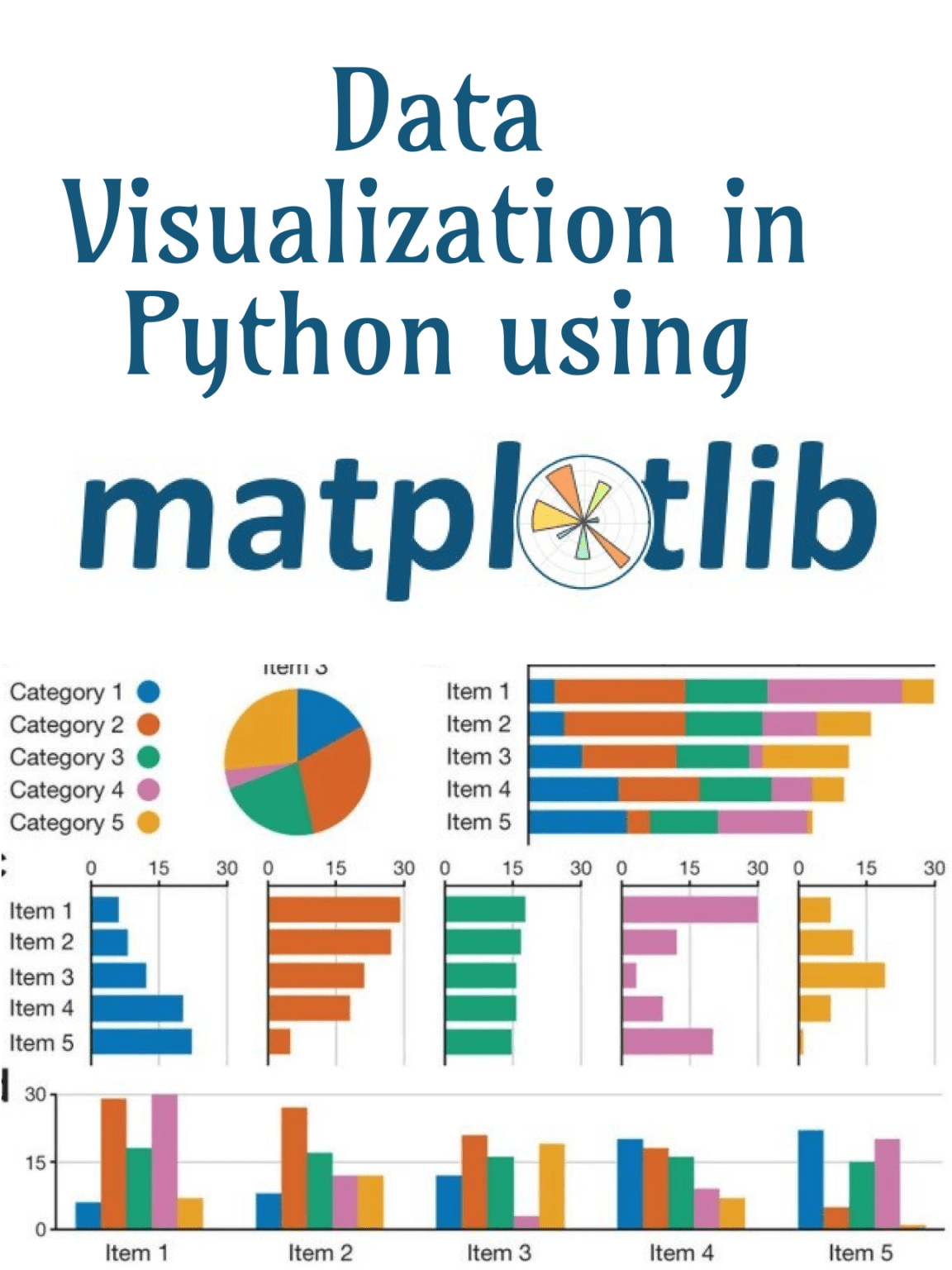
1.7. Part 6: Example
Here is an example of visualizing sales data using Matplotlib. The example uses sales data from a CSV file and then visualizes it using various types of plots.
1.5.3. Social Media Data Analysis
Perform sentiment analysis with bar plots.
Detect trends using time series visualizations.